I am going to show you an easy way to get a stunning floating menu effect you can use for a website.

I am going to make the canvas pretty large for this project to show you exactly how you could use this for a site. All of my screenshots will be sized smaller, but I will provide a link to view a larger version. So I will start off with an 800X600px canvas and make the background a dark blue color. I used #002F3F. Here is a color sample:

Now I am going to add 3 guides to my canvas so my menu is sized well. In my version of photoshop go to view>>new guide>> click horizontal and key in your size.

My first guide is at 70px horizontal, 2nd guide is 85px and 3rd guide is 100px.
H

Start a new layer and grab your rectangle marquee tool or your rectangle tool. Fill up the top space in between the guides with the color black:

Go into your blending options on that layer and use these settings for the gradient overlay:

The two colors used are: #296491 and #95C3CF Ok, do the same thing as in the last step, except fill in the bottom portion of the guides with black as well and choose these settings for the gradient overlay:

The two color used are: #000000 and 00415F You should have something like this so far:

Now I am going to make the first part of the glow to make this menu look like it is floating, so start another new layer. Get your elliptical marquee tool and draw a shape like this with a bright blue color. The color I used is #0089B8.

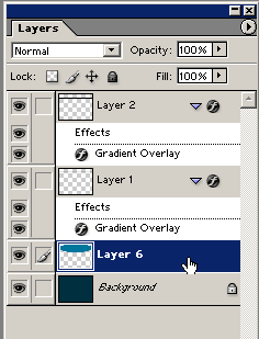
In the image above you can see my shape is under the other layers. In the image above you can see the shape under my other layers on the canvas, here is a screenshot of it under the layers on my layers palette.. Just grab the layer and drag it down:

Now we want to apply a gaussian blur to it by going to filter>>blur>>gaussian blur on the menu. Set it to a radius of 40 pixels. My result so far:

Now I am going to add a shadow to finalize the floating effect using my elliptical marquee tool again, except change the color to black. Start a new layer and make a shape like this under the menu layer:

Now apply another gaussian blur with a radius of 6.2 pixels Now you should have something similar to this:

That looks pretty good if you ask me... Now I am going to add a few more touches to finalize the menu. First draw a little white box that your menu's font will fit
in like this:

It doesn't matter where you put it on your menu because we will be duplicating them and moving them around in a our next few steps. Now set the little white box to a 20% opacity, then duplicate the layer four more times. Move them beside each other so that you see a little line in between them like this:

Center them on your menu the best you can. Next I am going to add font on each box for the menu text. I am using a font called Zurich CN BT but you can use any font because it will have the same effect. Here is my font on the menu:

Now add a drop shadow with blending options using these settings:

Now here is the result of that:

Then all you have to do is duplicate that text and move it to another block, also changing the text to say what you want on your menu. Here is my final menu:


